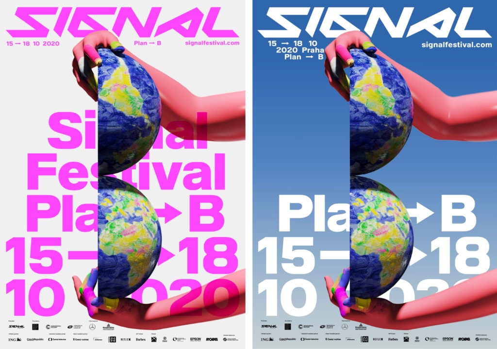
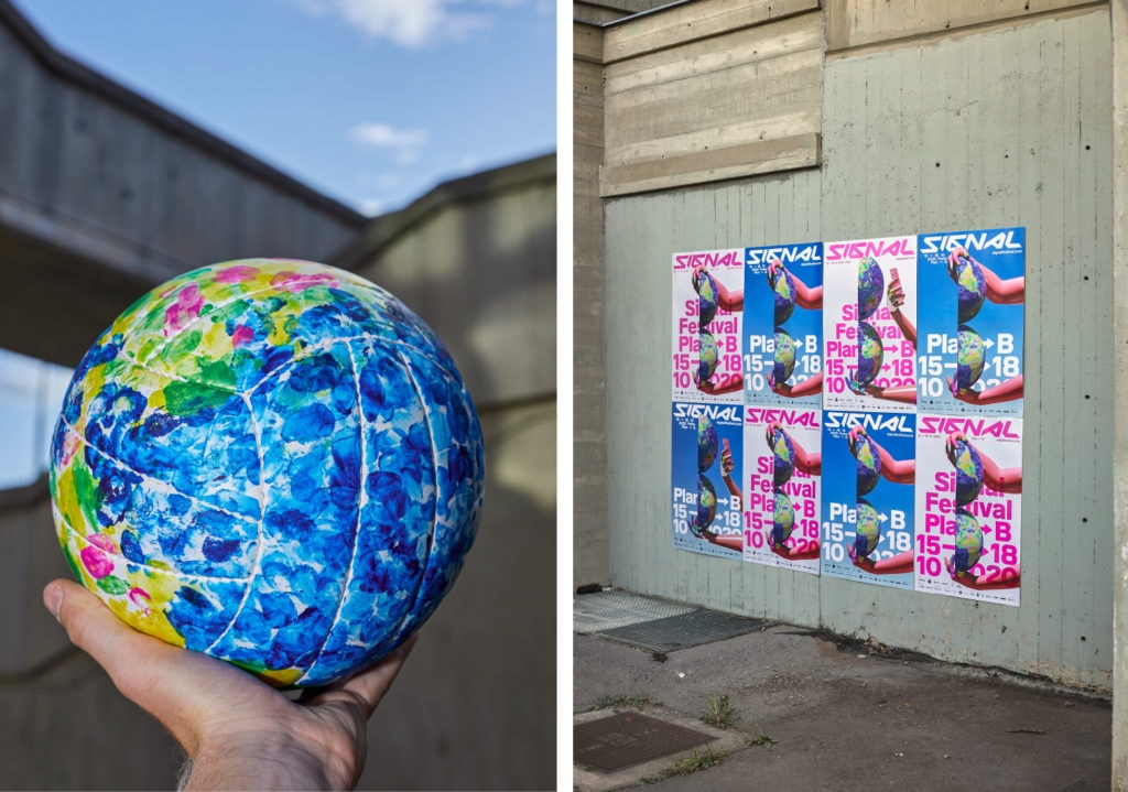
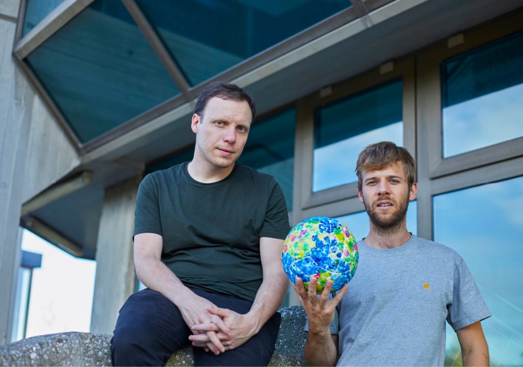
As usual, a new festival edition comes with the new visual, this year created by the duo Jan Novák and Jan Brož. They have taken up the theme of Plan B as a forerunner of the future, which, despite its urgency, is not necessarily pessimistic. In their conception, they focus on the future generation – today’s children, who will perceive “Plan B” primarily as a challenge and an opportunity. The final motif is a graphic abbreviation – the simplified geometry of the letter “B” is also a halved planet, which symbolizes the polarity of opinion that prevails in society – environmental awareness vs. eco-skepticism.
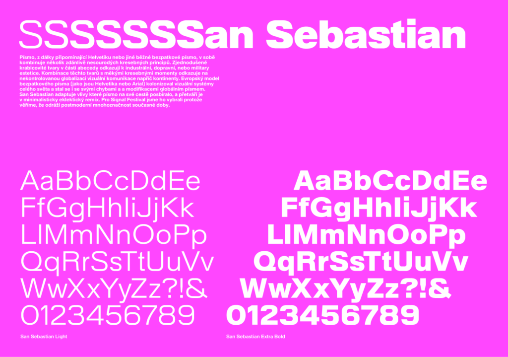
The festival font has also underwent a change. The new San Sebastian is a combination of simplified box shapes and soft drawing accents that reflect the versatility of today.
No more talking, just see for yourself how it looks.