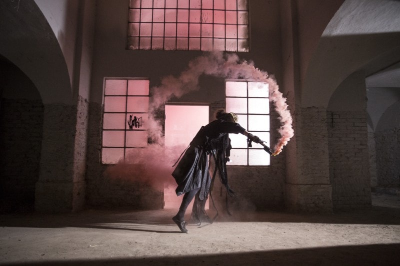
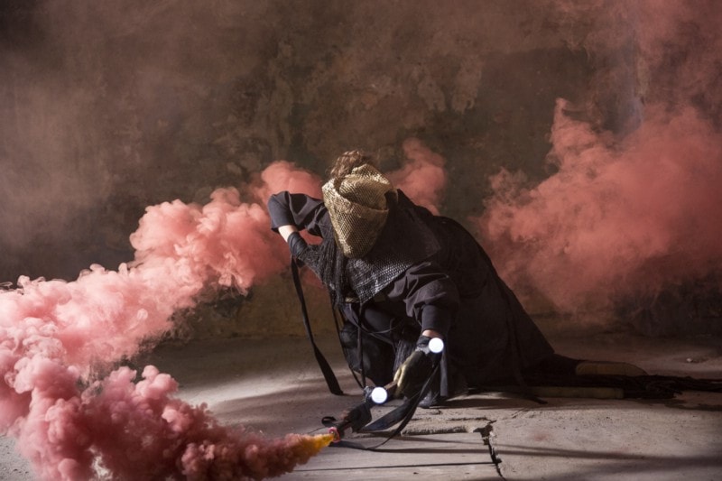
Last week we launched our outdoor campaign in the streets of Prague. You might have noticed the festival online campaign, for which an official jingle was created along with a series of photos. Who is behind these visuals? What was the main idea? And what does creation of visuals look like? Get into the secrets of our visuals with us.
AUTHOR
Also this year the visuals of the festival were taken care of by the Oficina studio. This creative studio is one of the pioneers of Czech motion design. It balances on the border of graphic design, animation, digital video, but also complex interactive installations. The studio is also the organizer of the acclaimed motion design festival Mouvo. Recently, the studio is engaged in interactive design, which you can know for example from exhibitions in the unique space of Prague‘s CAMP.
INSPIRATION AND MOTIF
The main theme of this year — the revolution — is of course reflected in the visuals as well. Revolutionary gesture ~ spontaneous movement ~ slogans sprayed on the wall ~ initial and unbounded disagreement, all this is illustrated by this year’s visuals.
The main inspiration for Oficina were shouts and tags on the Czech streets, various revolutionary slogans, and in the Czech context mainly the Lennon Wall.

The motif of spontaneous gesture connects three platforms — installation, video and print. The main platform is the gestic video installation The Wall, which the studio is creating for the main program of the festival. Every visitor will become a revolutionary while writing his message with a torchlight or making a personal gesture on a large projection screen. The same principle is transferred to the jingle in which the festival visitor is represented by an archetypal revolutionary. Likewise, in other visuals, where just this basic idea gradually transforms into a pure gesture that remains permanently in space.
GRAPHIC ELEMENTS
The main graphic element was, in addition to a real shot and photographed action of the “spraying” revolutionary, a relatively significant digital processing of the images. This creates the necessary tension and, above all, completion of the classic shots with a more modern feeling and thus a greater connection with the festival, whose main means of expression are modern digital media.
The Maax font has been accompanying our festival since last year and has become an integral part of its identity. Although originally intended to serve as a homogeneous complement to the distinctive logo of the festival, over time it has become a significant element for its extended character set, rectangular disposition in drawing, and emphasis on contrast, which has taken on the leading role of the identification sign of the Signal Festival.
PROCESS OF CREATION
The creation of visuals for the new year starts almost immediately after the previous edition. Through various meetings, discussions and clarification of the approach of a studio to the current topic, a definitive solution is gradually being developed. Every time, and as with other works, a general discussion begins between all the people who work in the studio, gradually crystallizing both the idea and the circle of authors who have to or want to get involved that year. Sometimes the lineup is more intimate, but this year, due to the chosen solution, almost the entire Oficina studio was involved.

We are looking forward to seeing you from October 10 to 13 in the streets and indoor areas of the Lesser Town, Old Town and Karlin. Learn more at www.signalfestival.com.